Isshin
CONTACT- Award
- Category
- Genre
- Profile
-
Visual artist.
Began creating videos in elementary school and has worked as a freelance creator since 2018.
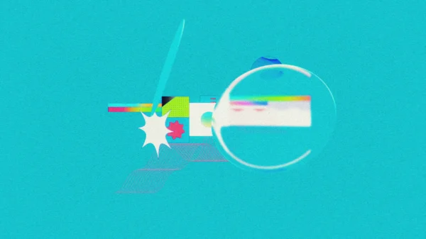
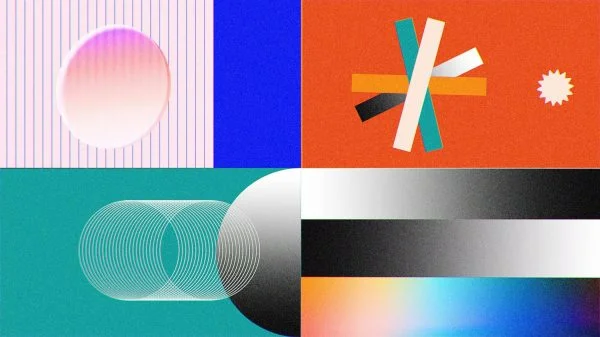
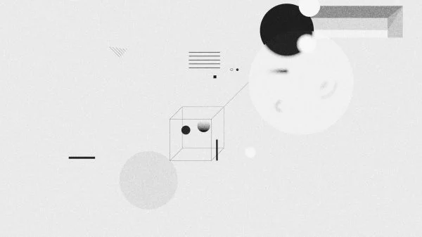
Specializing in short-form motion graphics centered on abstract forms, with organic movement and simple, refined visuals.
Primarily active through self-initiated projects while also directing commercials and other productions. Major works include opening sequences for NHK Special and Nippon TV programs, as well as promotional videos for Twitter, Google Play, and NewsPicks.
- Biography
-
映像作家100人 2021〜2024 連続選出。
Work


Loading...
No more content
Error loading content